About
I worked on the Abound design team as part of the Digital Foundry at Carrier. Abound product is a B2B application that helps maintain safer, healthier, and sustainable buildings by providing data visualizations and insights on air quality, energy performance, carbon emissions, and green building standards.
What I Did
Improved Abound's design system by developing and testing new components along with comprehensive documentation, and leading the adoption of the new design system to reduce product development time and inconsistencies.
Process
Audited design files for outdated components and potential new patterns
Built over 50 patterns for charting, data visualization, interactions, and more. Tested components for responsiveness, accessibility, and brand consistency
Created comprehensive guidelines to help designers navigate, use, and maintain the system
Built 2 new features and research materials
Process
Designed wireframes, mockups, and materials for user research
Led consistent adoption of new design system across features
Iterated based on feedback from team and evolving business requirements
Context
Almost all of Abound’s design files were using different deprecated design systems and components were spread out to decentralized files. Its local design system was also not up to date with the company's global design system used to ensure consistency across products.
Challenge
Create new components to ensure consistency throughout the product and reduce production time. Update Abound’s local design system to reflect the global design system while maintaining its product brand.
Centralize the patterns used across the product and create guidelines for use
Ensure a smooth transition to new design system in the development of new features
Building the system
Audit the ecosystem of design files
I was new to the team and unfamiliar with the work and ecosystem. I dived into the files for the most important, recently build features to adsorb as much as I could. Through this I learned the user flows, terminology, complex data visualizations, and how elements related to each other.
I organized all existing components and potential new patterns based on important factors like type, purpose, frequency, locations used, and whether or not they are deprecated.
How did this inform design decisions?
The audit gave a overview of the existing system and helped me to understand it deeply.
I learned what components to prioritize building based on the frequency of usage.
Studying inconsistencies made me think of what variants to consider and how to provide flexibility so designers can avoid detaching components.
Create the components and patterns
There were four main parts to reviving the design system:
Building new components / updating deprecated components
This included building elements like:
Smaller local components to match the global design system, while keeping its own brand.
Product-specific components that were lacking in the global design system or spread out in different files (for example: info cards, illustrations, alerts…)
Smaller sub-components needed to larger complex patterns
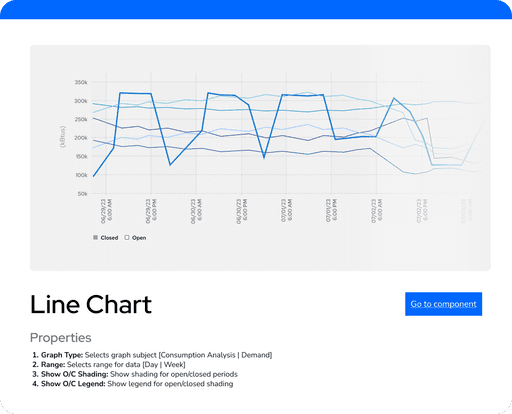
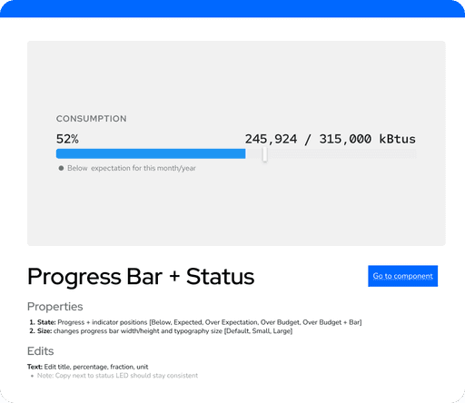
Building complex patterns for charting and data visualization
This is where the bulk of problem solving took place. I had to keep iterating on how to structure the component well and debug issues caused by the complexity of the charts and visualizations. The goal was to create robust and responsive components.
Adding useful variants and properties
I thought a lot about how to handle enough complexity so the designers don’t need to do while still giving enough choice and flexibility.

Test the components
To ensure the components are useful and last, it was crucial to rigorously test them and ask the following:
Are components responsive? Do they change how would expect them to, do they stay static where they need to?
Is consistent layout, borders, typography, and brand colors applied?
Are all properties consistently included and working?
Is auto layout working when components are instance swapped?
The design team was the end user so I made sure to ask them to experiment with the components and continuously integrated the user feedback. This was important to iterate and balance versatile components while giving agency to the designer as this affects how likely designers need to detach components and disrupt consistency.
Build a Guideline
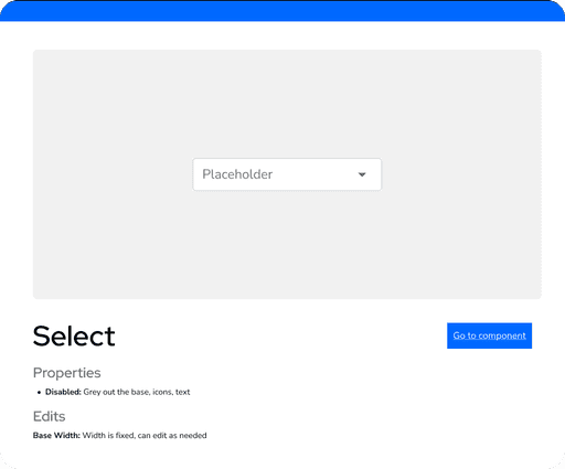
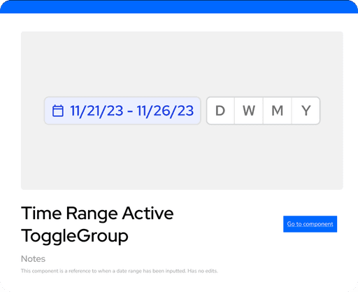
Provide visual table of contents to this new centralized system to make it easy to navigate
Provide guideline of how to use the component and its properties
Ensuring the guideline itself is easy to maintain and invest in
Building new features
I also developed new features and lead the adoption of the new design system through their development.
Feature 1: Extending Abound to Small Businesses
For research wireframes, I could build them out quickly using the new components but make a few changes to decrease the fidelity so users feel comfortable giving feedback.
I continuously iterated on how to represent the data that was most important to the new users.


Feature 2: Fault Detection System
After getting quickly caught up with the researcher team's work, I summarized their findings and brainstorming sessions in terms of the problem, context, and possible solutions flows.

I built out several of the requirements originally in wireframes. However, those made too many assumptions about what users (facilities managers) needed and prioritized. So I broke up the sections into cards that could be dragged around for research.

"This work feels like we actually understand our user. The way the design team took the work and organized all of the elements, creating a flow, its like a huge sense of relief to see something that seems to make so much sense for our users."
— Head of design research
What I Learned
Designers as users, balancing rules vs. creativity
Since the designer was the primary user, I made sure to get continuous feedback from them. I had to keep asking - how can we confine decision-making to create consistent, quality designs, while still giving autonomy to the designer to use their eye and expertise? We should be able to trust the system but in the end it’s the people who do the designing.
Navigating complexity through design
The team was constantly faced with complex terminology of equipment and devices, each with large sets of data points to work with. It was important to stay focused and ask good questions. We often designed on unsure and shifting information. It was the process of designing - making something tangible and showing to others - that got questions answered. Through continuous experimentation and mistakes, we’d build up the correct mental model to design from.
Proactively solving problems
My team members were all smart, curious, driven to solve the complex problems that arose from their everyday work. I learned a lot from them and began to take leadership on advocating the new design system. Rather than voicing complaints, I’d show how issues might be addressed through real examples.
Overall... I learned a lot about the process of creating, maintaining, using design systems out in the wild, as well as how to build a strong community.


