
I expanded and refined Abound's design system to align with Carrier's global Air Design System, ensuring consistency across products.
Abound by Carrier is a B2B application that helps maintain safer, healthier, and sustainable buildings by providing data visualizations and insights on air quality, energy performance, and green building standards.
At a glance
Created standardized UI components and provide documentation for seamless adoption by designers and developers.
Process
Audited design files for outdated components and potential new patterns.
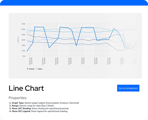
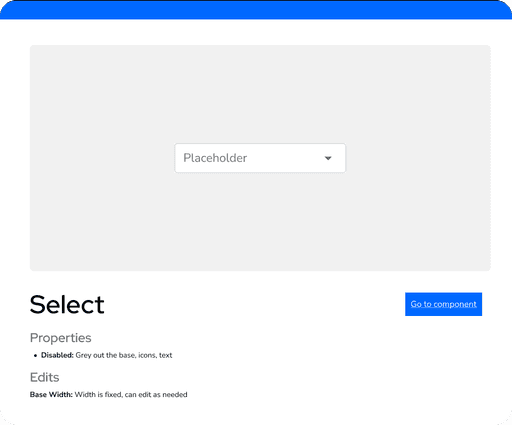
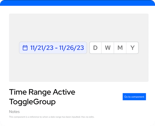
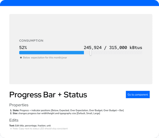
Built over 50 patterns for interactions, charting, data visualization, illustrations, and more.
Tested components for responsiveness, accessibility, and brand consistency.
Created comprehensive guidelines to help designers navigate, use, and maintain the system


Context
Most of Abound’s design files were using different deprecated design systems and components were spread out in various files. Its local design system was also not up to date with the company's global design system used to ensure consistency across products.
Challenge
Create new components and refine existing components to ensure a consistent user experience.
Process
Auditing the design ecosystem
I was unfamiliar with the product so I explored the most important features to learn the user flows, UI patterns, and data visualizations.
I organized all existing components and potential new patterns based on type, purpose, frequency, locations used, and deprecation status.
How did this inform design decisions?
I learned what components to prioritize building based on the frequency of usage.
Studying inconsistencies made me think of what variants to consider and how to provide flexibility so designers can avoid detaching components.


Creating components
Building the design system included three phases:
New components / updated deprecated components
Smaller local components to match the global design system, while keeping its own brand.
Product-specific components that were lacking in the global design system or spread out in different files.
Complex patterns for charting and data visualization
To make them robust, I had to keep iterating on how to structure the components well and problem-solve issues caused by the complexity of charts and visualizations.
Variants and properties
I thought a lot about how to handle enough complexity so the designers don’t need to do while still giving enough choice and flexibility.

A component guide for a chart with complex structure.
Testing the components
To ensure the components are useful and lasting, it was crucial to test them:
Are components responsive? Do they change how a designer would expect them to?
Does it apply consistent layout, borders, typography, and brand colors?
Are all properties consistently included and working?
Is auto layout working when components are instance swapped?
The design team was the end user so I made sure to ask them to experiment with the components and continuously integrated the user feedback.

A layout test using only the newly made components.
Building a Guideline
I created a guideline showing how to use each component along its layout and properties. The guideline also acts as a table of contents to find and navigate to the component. By creating this resource, it helps to keep the system useful and maintainable.
Final Product
Takeaways
Balancing constraints vs. intuition
It was important to make a design system that ensures consistent, quality designs while also trusting the designer's intuition and expertise. At first I tried incorporating as many possible design decisions into the components and their properties. From showing my work to the designers, I quickly found that there are often too many edge cases to account for and that the design system still needs to leave space for adjustments and quick decision-making.